
You’ve probably landed on a website before and instantly thought, “Whoa, this feels expensive.” Not because it had wild 3D graphics or dramatic scroll-triggered animations, but because the whole experience just felt… elevated. Clean. Intentional. High-end.
And then you hop back to your own site and think, “Okay, but how do I get mine to feel like that without learning code, dropping thousands, or turning my homepage into a motion graphic?”
Here’s the good news: a high-end website has a lot less to do with fancy effects and a lot more to do with the fundamentals—your layout, type, imagery, copy, and consistency. In other words, it’s about strategy and restraint, not technical wizardry.
Let’s walk through what actually makes a website feel luxurious and professional, and how you can get that “high-end” look without a single parallax scroll in sight.
High-End Starts With Simplicity, Not Complexity
When people think “high-end,” they often imagine more: more features, more sections, more visuals, more… everything. But if you pay attention to luxury brands—online and offline—you’ll notice the opposite. High-end brands create space. Space to breathe, space to focus, space to notice the details. Their websites aren’t crowded or chaotic. They’re intentional and edited.
This kind of simplicity doesn’t mean boring. It means you’ve made clear decisions about:
– What you want visitors to notice first
– What actions you want them to take
– What can be removed without hurting that experience
A cluttered site feels cheap because it communicates, “I’m trying to do everything at once.” A refined, simple site communicates, “I know exactly who I am and what I offer.” That clarity is what your audience reads as “high-end.” So before we talk about fonts or colors, start with this filter: if a section, image, or word doesn’t have a job, it doesn’t need to be on the page.
Typography: The Quiet Hero of a Luxe Website
If visuals are the outfit, typography is the tailoring. You can have the most beautiful words and images, but if your fonts feel off, everything instantly drops a level.
A high-end website usually has:
– A clear pairing of 2–3 typefaces (not six)
– Strong hierarchy (you can tell in a second what’s most important)
– Comfortable spacing (nothing feels cramped or shoved together)
You don’t need custom fonts to feel elevated, but you do need to be intentional. A few simple guidelines:
First, choose fonts with personality that matches your brand. Are you more modern and minimal, or warm and editorial? A sleek sans serif will send a very different signal than a romantic serif.
Second, define consistent styles. That means your headings, subheadings, body text, buttons, and links look the same across your site. When every page uses a different font size, weight, or spacing, it feels messy—like mismatched hangers in a closet. Consistency, on the other hand, feels polished and premium.
Third, give your text room. High-end sites often have more white space between lines and sections than you think you “should” need. That extra breathing room is what makes your content feel high-touch instead of rushed.
High-end design isn’t usually screaming for attention; it’s calm, confident, and easy to read. Your typography is a huge part of that.
White Space and Layout: The “Luxury Air” Around Your Content
If you’ve ever walked into a luxury boutique, you’ll notice there aren’t 47 things crammed onto every shelf. There’s intention in how each item is displayed, with a lot of empty space around it. White space (aka negative space) serves the same role on your website. It’s the space around your headlines, your images, your sections—and it’s one of the simplest ways to make your website feel more high-end overnight.
High-end layouts tend to:
– Use fewer elements per section
– Allow margins and padding to stay generous
– Lead your eye in a clear, relaxed path down the page
Instead of stacking ten different calls-to-action in a row, a high-end design might highlight one primary button and support it with a short, strong paragraph and a single image. Instead of a wall of text, it breaks content into digestible sections with clear headings and space in between.
The goal is to make your site feel intuitive. Visitors shouldn’t have to hunt for what to do next or squint to find important information. The more effortlessly they can move through your site, the more they subconsciously trust you—and trust is what feels premium.
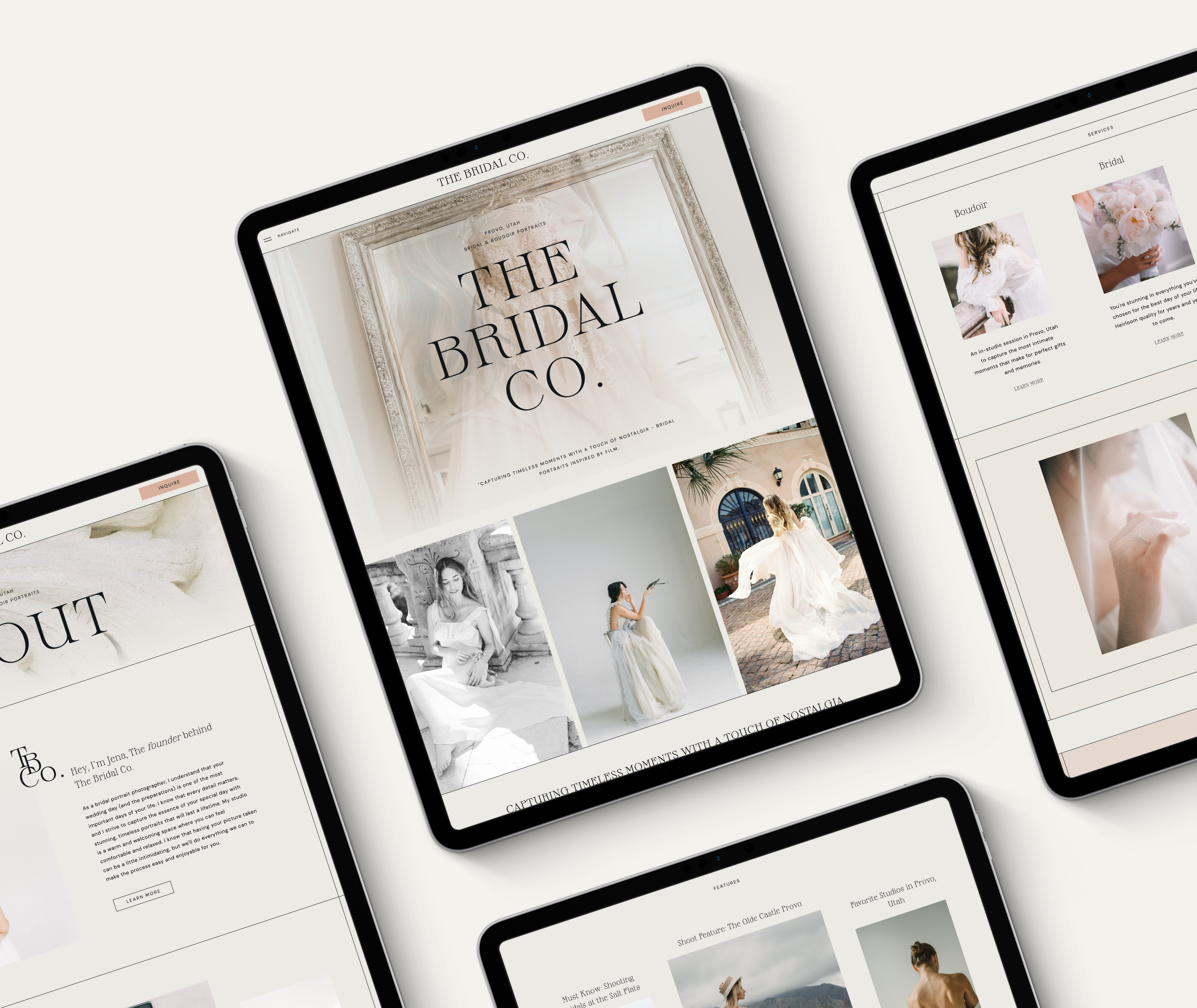
Imagery That Looks Custom (Even When It’s Not)
Nothing cheapens a website faster than generic, overused stock photos that show up on every other business site. On the flip side, nothing elevates your website faster than thoughtful, cohesive imagery. Now, yes—custom brand photography is amazing if it’s accessible. But even if you’re working with stock, you can still create a high-end feel by being picky. Ask yourself:
– Do these images feel like they belong to the same story?
– Do they reflect the mood of my brand: calm, bold, playful, luxurious, grounded?
– Do the colors in the photos play nicely with my brand palette or clash with it?
High-end imagery usually leans into:
– Natural light and clean composition
– Minimal backgrounds (less clutter in the frame)
– Intentional color tones (not a rainbow of randoms)
Then, think about how you’re using those images on the page. Large, full-width hero images or clean, well-cropped photos feel more sophisticated than tiny thumbnails or busy collages. And yes—you can absolutely have fun here. A high-end site doesn’t have to be cold or sterile. It just needs you to be decisive and consistent: one visual direction, carried through your whole site.
Confident Copy and Clear Messaging
Design does a lot of heavy lifting, but your words matter just as much. High-end websites sound different. They’re not shouting, they’re not begging, and they’re definitely not confusing.
Luxurious-feeling copy is:
– Clear: It’s obvious what you offer and who it’s for.
– Confident: No apologizing, hedging, or over-explaining.
– Focused: Every line serves a purpose.
If your headlines are vague or cute but unclear, that can undercut an otherwise beautiful design. A high-end homepage doesn’t bury the lead—it tells visitors exactly what you do and why they should care within the first screen. You’ll also notice that high-end sites repeat their core message in a few key ways: in the hero headline, in a simple “what you do” section, and in the way each service or offer is described. This repetition doesn’t make the site feel redundant; it makes it feel sure of itself.
So as you refine your site, ask:
– Is my main message obvious within 3–5 seconds?
– Does my copy sound like a real person who knows their craft?
– Am I saying more than I need to, or can I edit this down?
Editing your copy is as powerful as editing your visuals. Fewer, stronger words feel a lot more high-end than paragraphs you had to squeeze into every corner.
Color, Branding, and That “Put-Together” Feeling
Another hallmark of a high-end website: the brand feels cohesive. The colors, fonts, imagery, and tone all point in the same direction. Nothing feels random or like it got added “just because.” You don’t need a dozen colors to feel elevated. In fact, most high-end brands use a tight palette and repeat it consistently. Think: one primary brand color, one accent, and a handful of neutrals.
Here’s what that looks like on your site:
– Buttons and links use your primary accent color, consistently.
– Headings and body text remain in the same few tones (often black, charcoal, or a dark neutral).
– Backgrounds are mostly light or mostly dark, not switching wildly from section to section.
That kind of consistency makes your site easier to navigate and more memorable. It also makes every small detail feel intentional—from your navigation hover states to your footer links.
A high-end brand online doesn’t rely on gimmicks. It relies on alignment. Every visual choice is quietly saying the same thing about you, over and over.
User Experience: The Invisible Luxury
There’s one more piece that makes a website feel high-end, and you don’t see it so much as you feel it: how easy it is to use. Even without any fancy animations, a luxurious site feels:
– Fast (no endless loading or lag)
– Smooth (no broken links, no weird layout jumps)
– Clear (you always know where you are and how to get where you want to go)
Think about high-end hospitality. At a great hotel, you rarely have to ask where something is or how something works. It’s intuitive. Your website can offer that same ease.
That means:
– Your navigation is simple and logical
– Your buttons look like buttons and stand out enough to be clickable
– Your mobile experience is just as intentional as your desktop
A stunning desktop site that breaks on a phone will not feel high-end to your audience. Most people are meeting you on mobile first, so making sure your layouts, font sizes, and spacing work beautifully on a smaller screen is one of the best “luxury” moves you can make. And here’s the beauty: improving user experience doesn’t require any flashy effects. It just requires care, testing, and a willingness to simplify.
You Don’t Need Fancy Animations—You Need Intention
Animations and movement can absolutely be the cherry on top of a gorgeous site—but they are not the sundae. In fact, when they’re overused or added without strategy, they can make your website feel chaotic or dated instead of polished. A truly high-end website would still feel high-end if you stripped out every hover effect and scroll animation. Why? Because the foundation is solid:
– Clear, confident messaging
– Thoughtful typography
– Cohesive imagery
– Clean layouts with space to breathe
– Consistent branding
– Smooth, user-friendly experience
If you want to add a subtle fade-in here or a gentle hover there once your foundation is strong, go for it. But let those be small, delightful details—not the thing doing all the heavy lifting. When you focus on the fundamentals first, your site will feel sophisticated whether or not you ever touch an animation panel.
A high-end website isn’t reserved for luxury fashion houses or massive corporations. It’s absolutely possible for a small business—yes, even a one-person show—to create an elevated, polished online presence without custom code or elaborate effects.
The secret isn’t in the flash. It’s in the fundamentals: simple, clear layouts; typography that feels intentional; imagery that supports your story; copy that speaks directly to the right people; and a user experience that feels effortless.
When you strip away the noise and design from a place of clarity and confidence, your website starts to do more than just look pretty. It begins to feel like a true extension of your brand—a place where your dream clients instantly think, “I’m in the right spot.”
That “high-end” feeling? It’s just your website finally matching the quality of the work you already do.